About NaN Tragedy
†
Can tragedy be avoided? Sci-fi made us dream that time travel could help avoid the worst events, while also warning about unexpected consequences. NaN tragedy is one of these unexpected consequences, a chimera child of 2 epochs. Its structure and energy are inheriting the pace of a monastic scribe hand while its geometrical digital detail treatment lies in the atom accelerator at CERN. NaN Tragedy makes this tension between calligraphy and vector graphics palpable.
Tragedy tells a story of deadly opposites lying in the same body. Classical but contemporary. Unconventional but functional. Energetic and lively but sturdy. Extravagant but evident and simple.
NaN Tragedy Text embraces the challenge of being a functional text typeface with unconventional shapes. To achieve this, it applies an economic approach and optical corrections to display features. It follows an exaggerated calligraphic contrast axis that creates graphic detailing and brings fabulously long exit strokes in round letters. But these idiosyncrasies come upon a classic skeleton: Tragedy says # tradition and # legacy with one mouth, while the other face of this Janus looks towards modernity. It mixes exaggerated and virtuosos forms (look at the italics) with more simple, bare bones details. This entanglement of simplicity and drama creates a tension that spices up any piece of design.
Because caricature was always a part of the tragic theatre, we had to push Tragedy's features to their extremes with a Display cut. NaN Tragedy Display emphasizes the extravaganza of the Text version in a more compact and contrasted design buckling down on finesse and character for tight and impactful headlines.
On the design stage, NaN Tragedy is a versatile versatile family of actors with a very distinctive voice ready for editorial to branding scenarios. Traveling back in time, the question will now be, can NaN Tragedy be really avoided?
Jean-Baptiste Morizot
Designed 2019-2021
Supporting 224 latin based languages
TTF, WOFF2 (Autohinted)
Download free trial fonts
I am at the end. I exist no more.
It's human; we all put self interest first.
O, gods, what horror! Oh, what misery!NaN Tragedy Display pt/pt Tracking 0%
ABCDEFGHIJKLMNOPQRSTUVWXYZ

    abcdefghijklmnopqrstuvwxyz0123456789

    !@£$%^&*({[?]})
- NaN Tragedy Display Light
- NaN Tragedy Display Regular
- NaN Tragedy Display Medium
- NaN Tragedy Display Bold
- NaN Tragedy Display Black
- NaN Tragedy Text Regular
- NaN Tragedy Text Medium
- NaN Tragedy Text Semibold
- NaN Tragedy Text Bold
- NaN Tragedy Text Italic
- NaN Tragedy Text Medium Italic
- NaN Tragedy Text Semibold Italic
- NaN Tragedy Text Bold Italic
Mortal fate
To exist is pain
He loves power.
A terrible love
I ask this one thing:
let me go mad in my own way
I live in a place of tears
On, on! Run, dance, delirious, possessed!
For Time calls only once, and that determines all
Now is no time to delay. This is the edge of action.
Mortal fate is hard.
You’d best get used to it.
We would have to think the gods had no minds, to pray for murderers.
You don't know what your life is, nor what you're doing, nor who you are.
The origin of the word tragedy has been a matter of discussion from ancient times. The primary source of knowledge on the question is the Poetics of Aristotle. Aristotle was able to gather first-hand documentation from theater performance in Attica, which is inaccessible to scholars today. His work is therefore invaluable for the study of ancient tragedy, even if his testimony is open to doubt on some points.
The origin of the word tragedy has been a matter of discussion from ancient times. The primary source of knowledge on the question is the Poetics of Aristotle. Aristotle was able to gather first-hand documentation from theater performance in Attica, which is inaccessible to scholars today. His work is therefore invaluable for the study of ancient tragedy, even if his testimony is open to doubt on some points.

According to Aristotle, tragedy evolved from the satyr dithyramb, an Ancient Greek hymn, which was sung along with dancing in honor of Dionysus. The term τραγῳδία, derived from τράγος "goat" and ᾠδή "song", means "song
The origin of the word tragedy has been a matter of discussion from ancient times. The primary source of knowledge on the question is the Poetics of Aristotle. Aristotle was able to gather first-hand documentation from theater performance in Attica, which is inaccessible to scholars today. His work is therefore invaluable for the study of ancient tragedy, even if his testimony is open to doubt on some points.

According to Aristotle, tragedy evolved from the satyr dithyramb, an Ancient Greek hymn, which was sung along with dancing in honor of Dionysus. The term τραγῳδία, derived from τράγος "goat" and ᾠδή "song", means "song of the goats," referring to the chorus of satyrs. Others suggest that the term came into being when the legendary Thespis (the root for the English word thespian) competed in the first tragic competition for the prize of a goat (hence tragedy).[1]
The origin of the word tragedy has been a matter of discussion from ancient times. The primary source of knowledge on the question is the Poetics of Aristotle. Aristotle was able to gather first-hand documentation from theater performance in Attica, which is inaccessible to scholars today. His work is therefore invaluable for the study of ancient tragedy, even if his testimony is open to doubt on some points.
The origin of the word tragedy has been a matter of discussion from ancient times. The primary source of knowledge on the question is the Poetics of Aristotle. Aristotle was able to gather first-hand documentation from theater performance in Attica, which is inaccessible to scholars today. His work is therefore invaluable for the study of ancient tragedy, even if his testimony is open to doubt on some points.

According to Aristotle, tragedy evolved from the satyr dithyramb, an Ancient Greek hymn, which was sung along with dancing in honor of Dionysus. The term τραγῳδία, derived from τράγος "goat" and ᾠδή "song", means "song
The origin of the word tragedy has been a matter of discussion from ancient times. The primary source of knowledge on the question is the Poetics of Aristotle. Aristotle was able to gather first-hand documentation from theater performance in Attica, which is inaccessible to scholars today. His work is therefore invaluable for the study of ancient tragedy, even if his testimony is open to doubt on some points.

According to Aristotle, tragedy evolved from the satyr dithyramb, an Ancient Greek hymn, which was sung along with dancing in honor of Dionysus. The term τραγῳδία, derived from τράγος "goat" and ᾠδή "song", means "song of the goats," referring to the chorus of satyrs. Others suggest that the term came into being when the legendary Thespis (the root for the English word thespian) competed in the first tragic competition for the prize of a goat (hence tragedy).[1]
Making NaN Tragedy
†
At the beginning, a typeface is often full of charming details and sick ideas. Then you work on it, stabilize the shapes, tune the glyphs together, and at the end it's not anymore just “a collection of beautiful letters, but a beautiful collection of letters.” As one said. Let me tell you how the funky cocoa crazy fonts became NaN Tragedy.
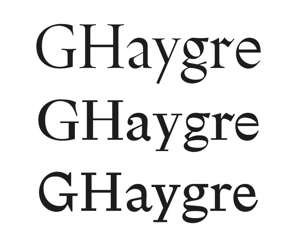
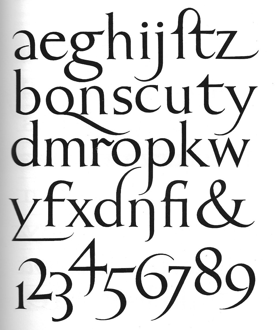
I started working on NaN Tragedy in 2019, on the basis of two other abandoned typefaces. The first one (see figure 1, top line) was a loose revival of English serif fonts from the 1900’s. I used various reference like stone carving on ex-voto, a model Gill made for signpainters,—but also a lovely lowercase alphabet created by Russell Laker to fit the capitalis monumentalis from the Roman Empire (see figure 4). This unnamed and very contrasted typeface featured long spiky exit strokes and quite modulated serifs. It showed some eccentricity I really like, but it feels a little too old fashioned otherwise.
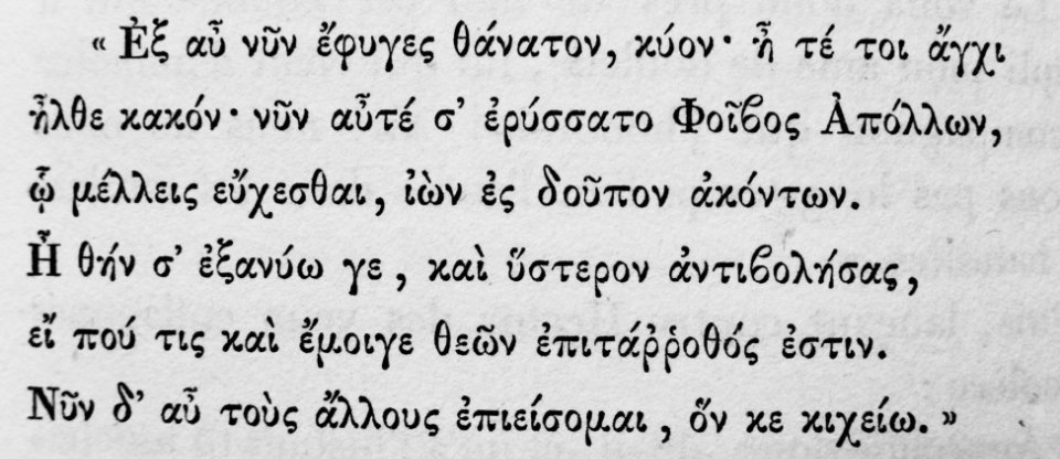
The second one (figure 1, middle line) was a more contemporary take on the serif genre. It borrowed some elements from the previous one, but offers a more simple design; the serifs became straight rectangles for example. However the most important thing was the influence of Greek typography. Because the Greek calligraphy is based on connected looping strokes and not parallel stems like in Latin, the distribution of the contrast can flow very differently (look at the one cut by Firmin Didot in figure 3). I began to draw with that open approach in mind, and started a font in which it's sometime the horizontal stroke that becomes thick and the vertical become thin. Obviously it doesn’t always work that well in Latin, so in the end I only used an exaggerated axis in round letters. It was the right solution: it mimics this idea of free repartition of thin/thick while still making sense in Latin.
At some point, I kind of merge the two typefaces—the calligraphic traditional energy and the more clean contemporary construction—which was the haha moment that led to NaN Tragedy (figure 1, bottom line). But of course, the family was know at this time under the development code name “TXT25”. ‘A dev code name? Why the heck would you do that?’ you‘ll probably ask. Well, NaN Tragedy doesn‘t followed the traditional way of publishing typefaces, and was pre-released on the groundbreaking platform FutureFonts. If you don’t know about it, Future Fonts is a website that allows people to license fonts in progress for a lower price, getting all the updates for free. It allows type designers to sell licenses before the fonts are finished, but also gather comments from customers.
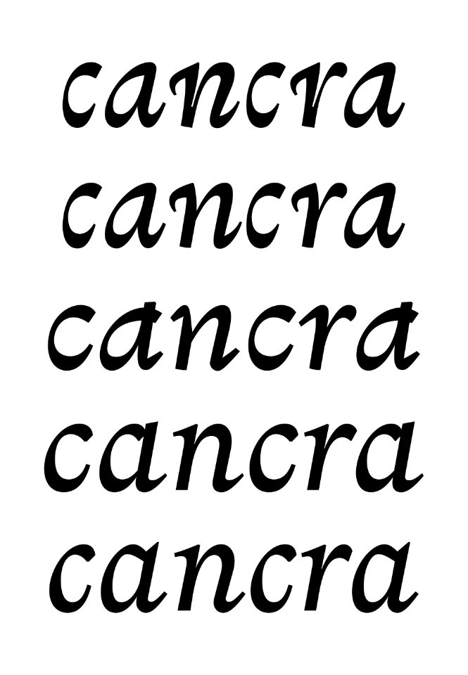
So TXT25 found a shelter on FutureFonts, people made comments, sent DM on instagram, wrote emails sometimes, sharing images of books and posters made with the beta fonts. I used the feedbacks to improve the design, as you can see that on the evolution of italics (Figure 2), that used baroque serifs at first, then very calligraphic strokes, until they were stabilized.
At some point, NaN expressed interest for TXT25 and Luke gently gave me feedback and encouragements to bring TXT25 to its final form: NaN Tragedy. It implied a bigger glyphset (hello Vietnamese!), but most importantly we decided to add a Display cut for big sizes. NaN Tragedy was meant as a body copy typeface, with a low contrast and loose spacing, but since it features so many tricks and eccentricity it was a shame to not use it in big size. We ended up with the sharp and striking NaN Tragedy Display family, with its high contrast, low ascenders and narrow width. No reason to use NaN Tragedy in book size only now, you can make it bigger, on magazine covers, museum posters, subway advertising, or on the front of a skyscraper.
Thank You
†
Jérémy Landes for his comments and encouragements, Julien Imbert for his feedback and his graphic designer point of view, Kris Sowersby for reviewing it just before it was published on FutureFonts, Xavier Dupré for his insightful advices (remove the balls!) and of course FutureFonts that made possible the release of NaN Tragedy at early stage when it was still a baby TXT25 looking for its final form. A special thanks to Luke Prowse who encouraged me to finish the fonts and to add a Display cut.
— Jean-Baptiste Morizot
Credits
†
Thank you to Jack Llewelyn for his support designing this site.
Thank you Myriam Heinzel for the beautiful illustrations used throughout.
Thank you to Jérémy Landes for writing about the fonts and overall support and enthusiam.
Thanks to Igino Marini for ikerning the final fonts.
A massive thank you Johannes Neumeier for his expert and patient help developing this microsite.
Art direction, additional design and code: NaN.xyz